Your frame, rebuilt from real components.
Select a frame in Figma and ask your editor's agent to build it. It reads the design from Figma, finds the closest match among 307 blocks and 126 pages here, installs them, and restyles them to your tokens. No plugin to install, no export step, no handoff document.
Three moves, and one of them is setup
Connect both servers, once
Turn on Figma's Dev Mode MCP server in the desktop app's preferences, then register it and Hoverlab with your editor's agent. Two lines, and nothing to sign in to — Hoverlab's server takes no key and no account.
Select a frame and describe it
Ask by intent, not by pixel. The agent reads the frame’s structure from Figma — what regions it has, what is in them — rather than screenshotting it.
Get real components, not a render
It calls match_design once per region, installs the winners into your project, and edits the installed React to your colours, spacing and type. What lands is source you own and can keep editing.
Or take the tokens right now
One click puts both palettes, the radius scale, the two families and the three heading sizes on your clipboard as SVG. Figma turns that into named, editable layers on paste — the headings arrive as real text at their real sizes, one step from a text style — with no plugin, no file and no account. It is the same token set every one of the 307 blocks is built from, so a screen drawn against it is a screen the code can already make.
The whole setup
Both servers, registered with Claude Code. Any MCP client works the same way — the MCP docs have the config-file form.
claude mcp add --transport http figma http://127.0.0.1:3845/mcp
claude mcp add hoverlab -- npx -y hoverlab mcp
And the sentence to type
Designer vocabulary is fine. match_design translates “navbar”, “plan cards” and “modal” into catalog vocabulary and ranks partial matches by how much of your description they actually cover.
Rebuild my selected Figma frame: find the closest Hoverlab
blocks, install them, and match my colours and type.
What lands in the repo
- Plain React and Tailwind against semantic tokens, so it inherits the project's theme instead of fighting it.
- Keyboard and screen-reader behaviour already handled — the part a generated render leaves out.
- The dependency list up front, and every prop defaulted so it renders before it is wired up.
- Source your team owns. Nothing phones home, and nothing breaks when we deploy.
Where it stops
A static design shows layout, so this matches blocks and pages well. Hover states and motion are invisible in a frame — ask for those in words and the effect tools take over, across 1,126 pure-CSS effects.
No Figma at all? A pasted screenshot works — agents read images, and match_design only needs the structure described to it.
Or open the sections in Figma
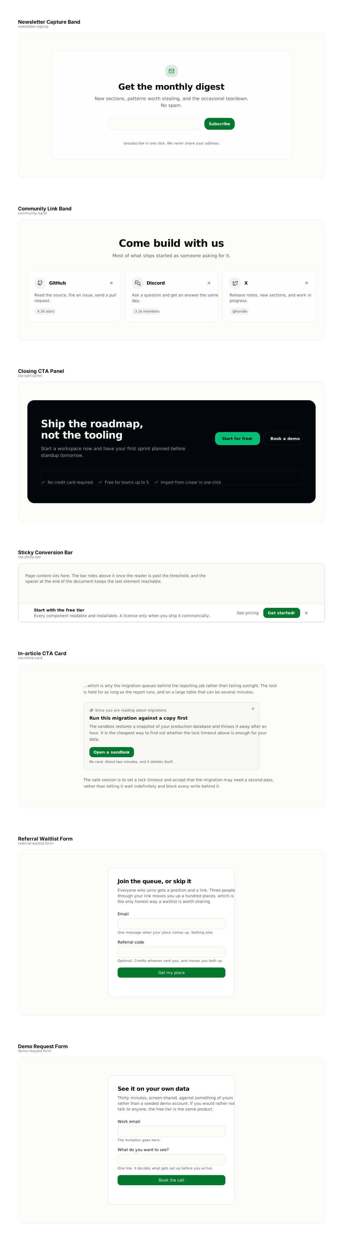
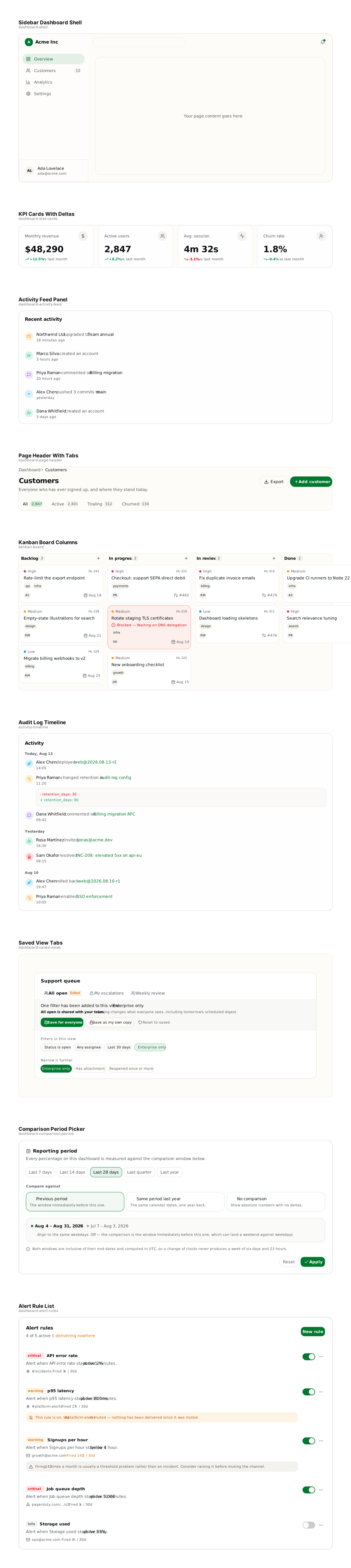
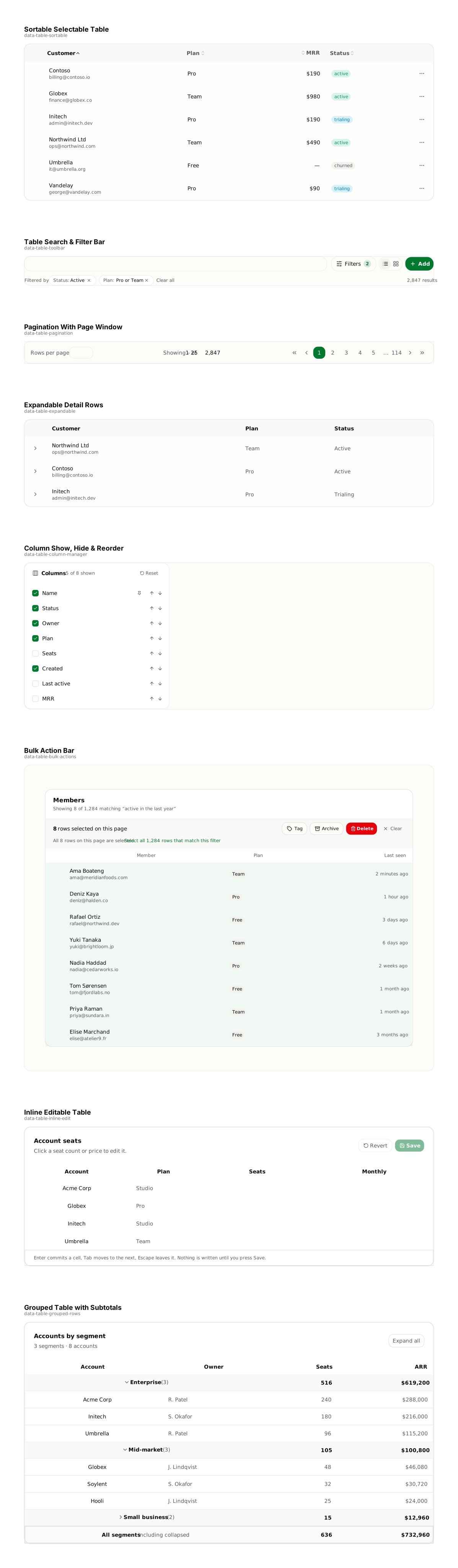
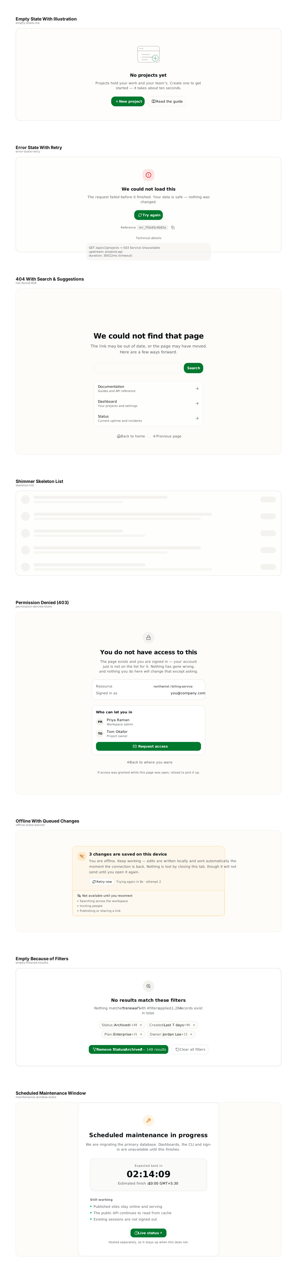
Every section in the catalog, traced from what actually renders and stitched into one file per category. Drag one onto a Figma canvas and each block arrives as a named, editable frame — real geometry, real colours, real type. 307 sections, free, no account.
These are frames, not components. No variants, no auto-layout, and no hover or motion — none of those exist in a static frame. If you want a component library with variants, the vendors who sell one are named on our comparison page, which still concedes that row to them.
- After-Sale Service9 sections · 106 KB
- Agent Chat8 sections · 64 KB
- Agent Reasoning7 sections · 45 KB
- Authentication9 sections · 35 KB
- Billing & Usage8 sections · 53 KB
- Cart & Checkout9 sections · 62 KB
- Charts & Metrics10 sections · 88 KB
- Command & Search10 sections · 72 KB
- Communication9 sections · 88 KB
- Contact & Forms6 sections · 27 KB
- Content & Blog12 sections · 115 KB
- CRUD12 sections · 93 KB
- CTA Sections7 sections · 25 KB
- Dashboards9 sections · 82 KB
- Data Tables8 sections · 58 KB
- Email Templates4 sections · 6 KB
- Empty & Error States8 sections · 38 KB
- FAQ7 sections · 48 KB
- Feature Sections8 sections · 73 KB
- File Upload7 sections · 37 KB
- Footers5 sections · 27 KB
- Heroes14 sections · 83 KB
- Human in the Loop8 sections · 59 KB
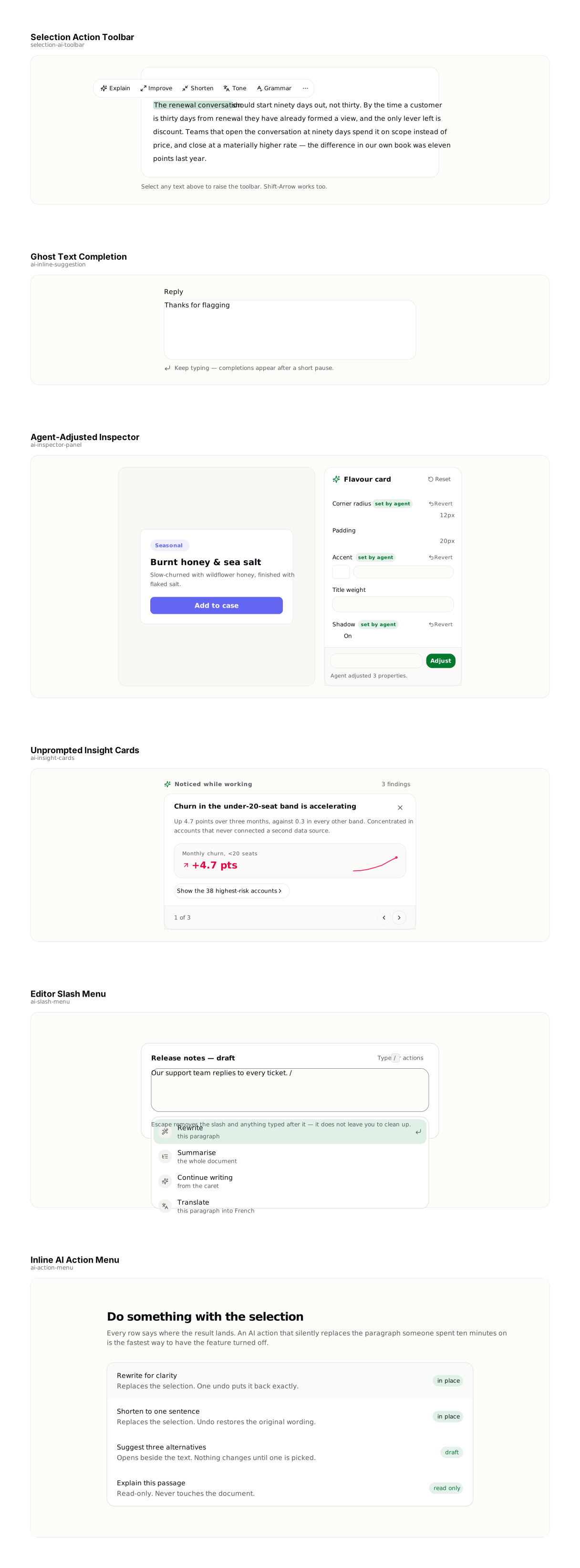
- Inline AI Actions6 sections · 31 KB
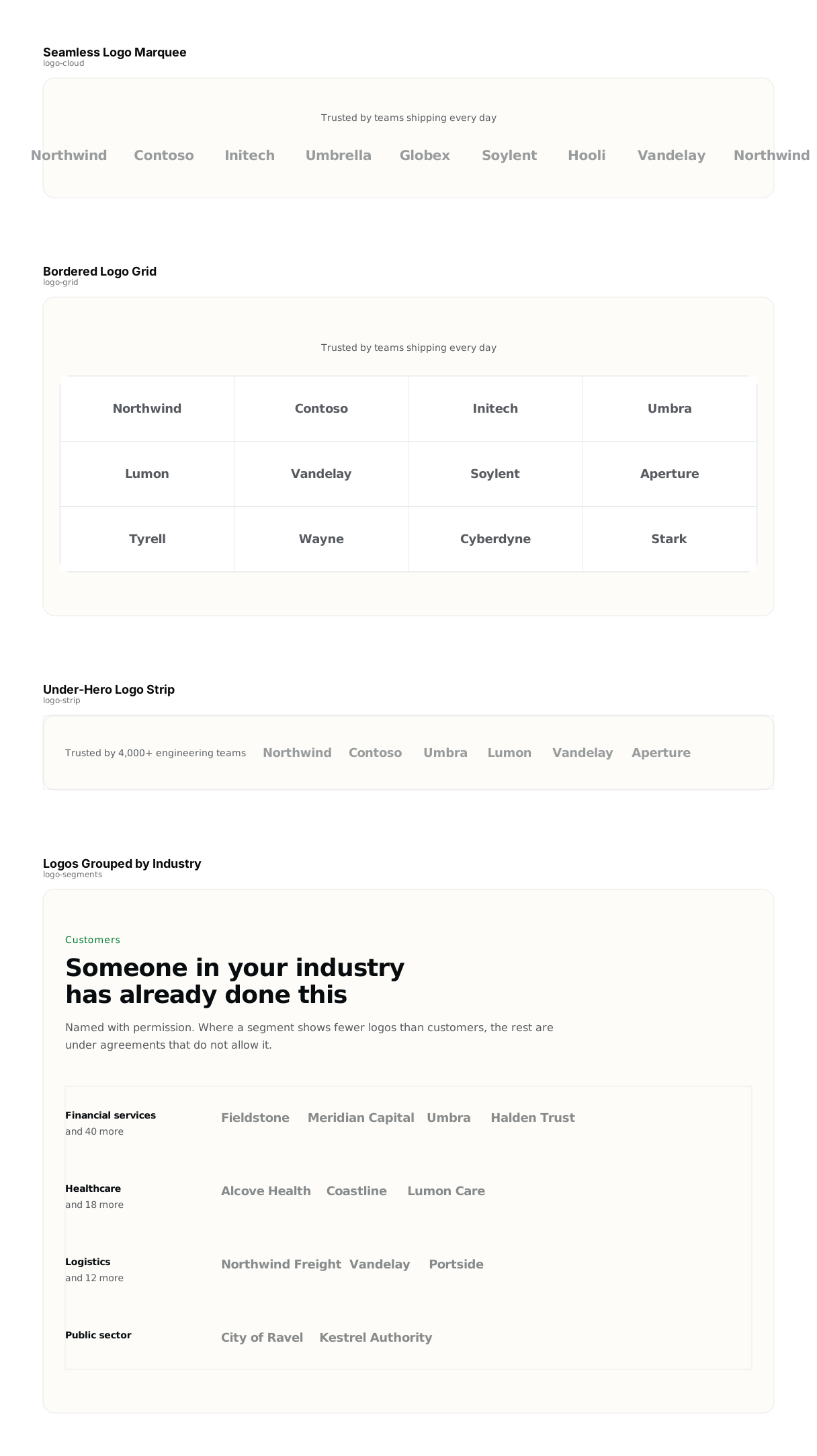
- Logo Clouds4 sections · 15 KB
- Modals & Drawers8 sections · 37 KB
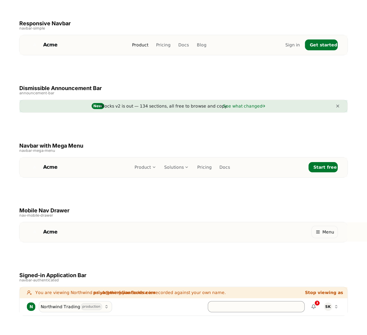
- Navigation5 sections · 12 KB
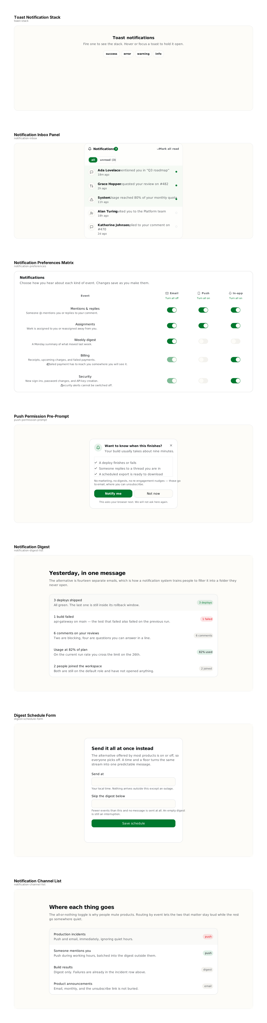
- Notifications7 sections · 37 KB
- Onboarding8 sections · 47 KB
- Orders & Reviews7 sections · 59 KB
- Pricing8 sections · 52 KB
- Product Detail7 sections · 37 KB
- Product Listings9 sections · 77 KB
- Retrieval & Context9 sections · 80 KB
- Scheduling & Calendar3 sections · 49 KB
- Settings8 sections · 55 KB
- Sidebars11 sections · 67 KB
- Stats7 sections · 36 KB
- Testimonials6 sections · 68 KB

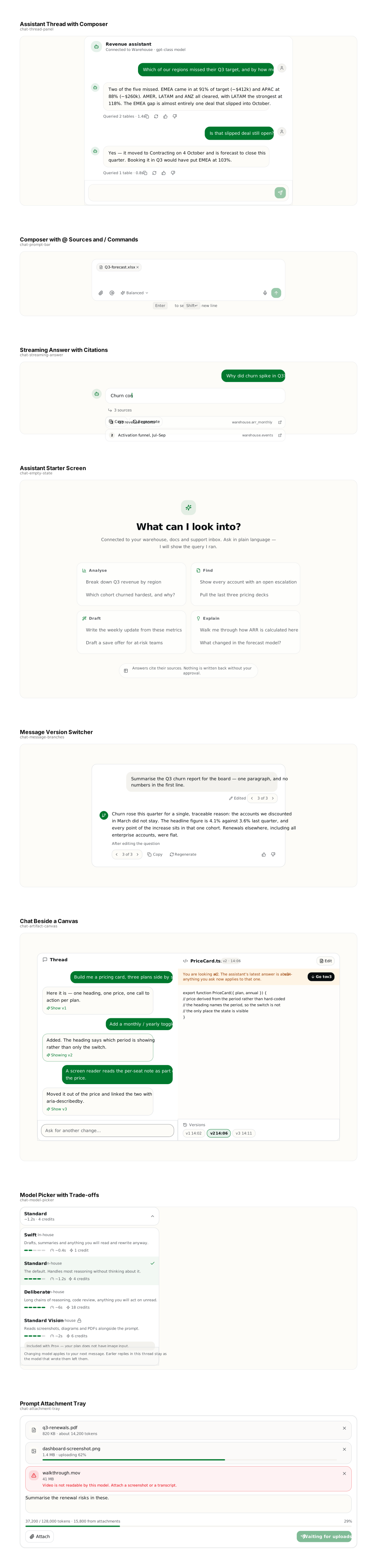
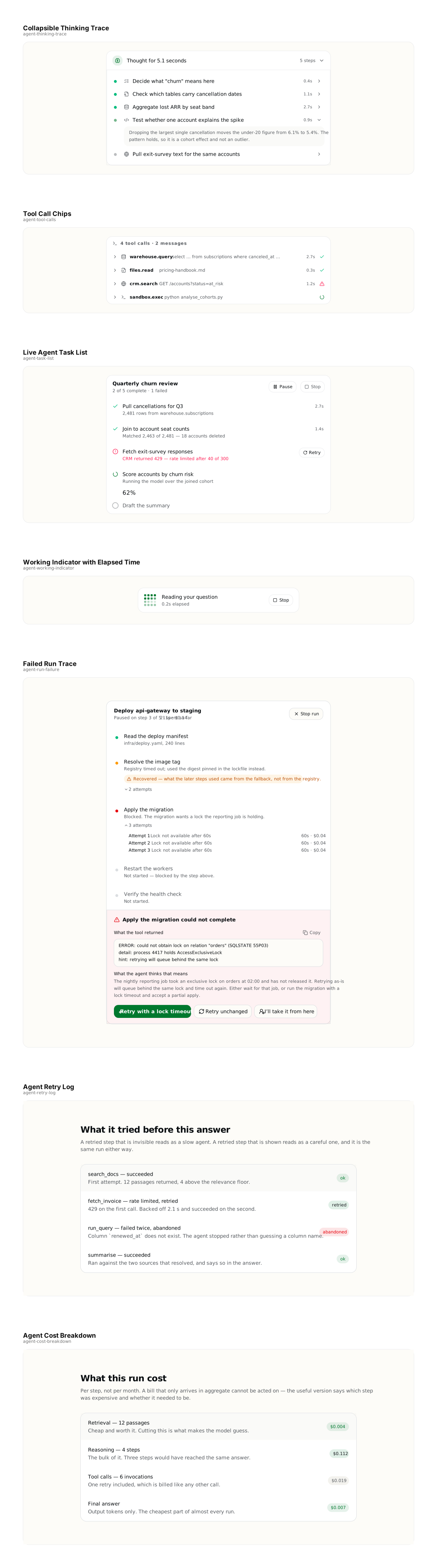

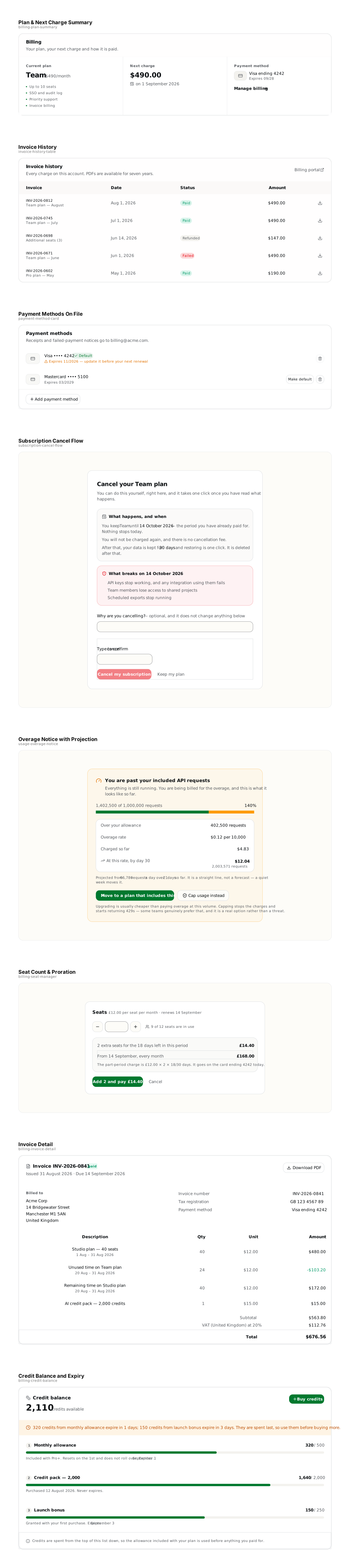




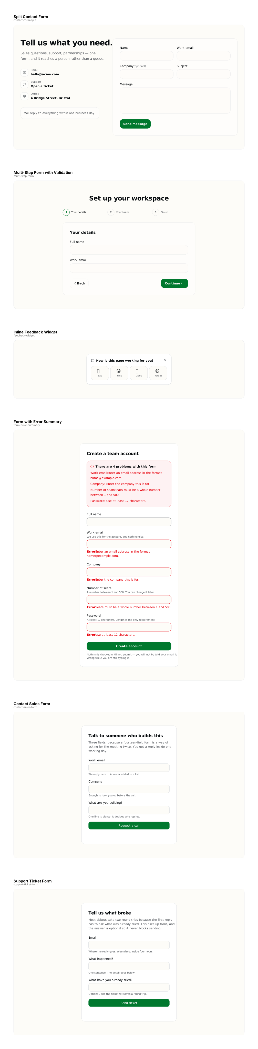











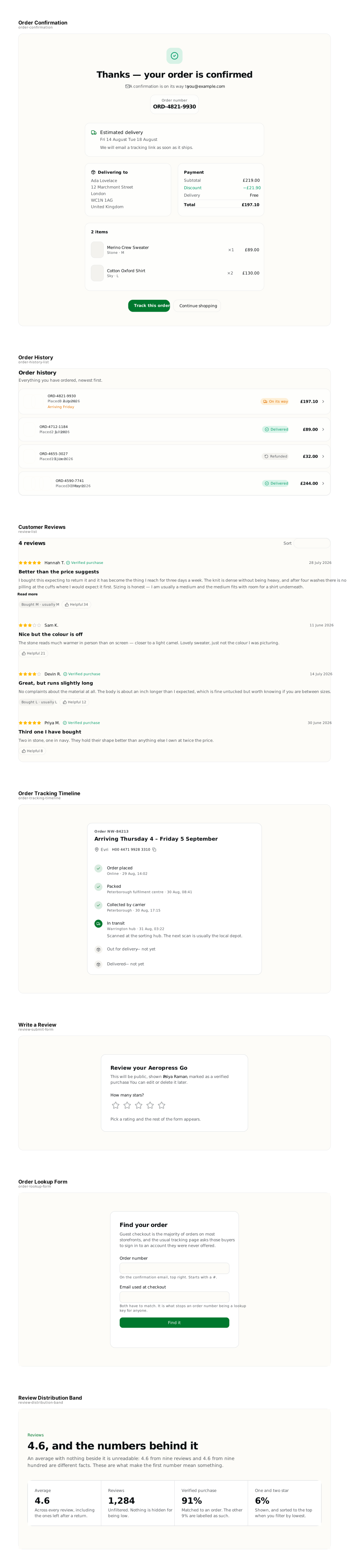



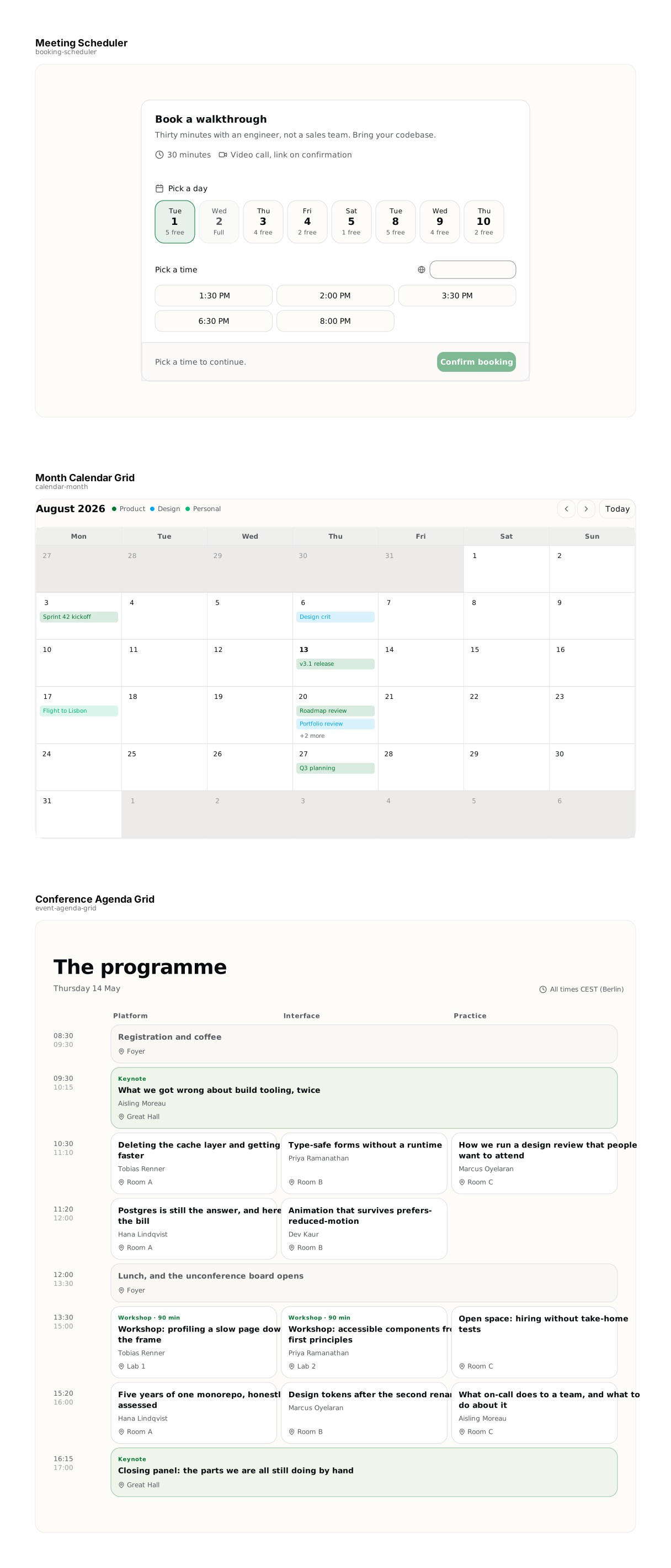
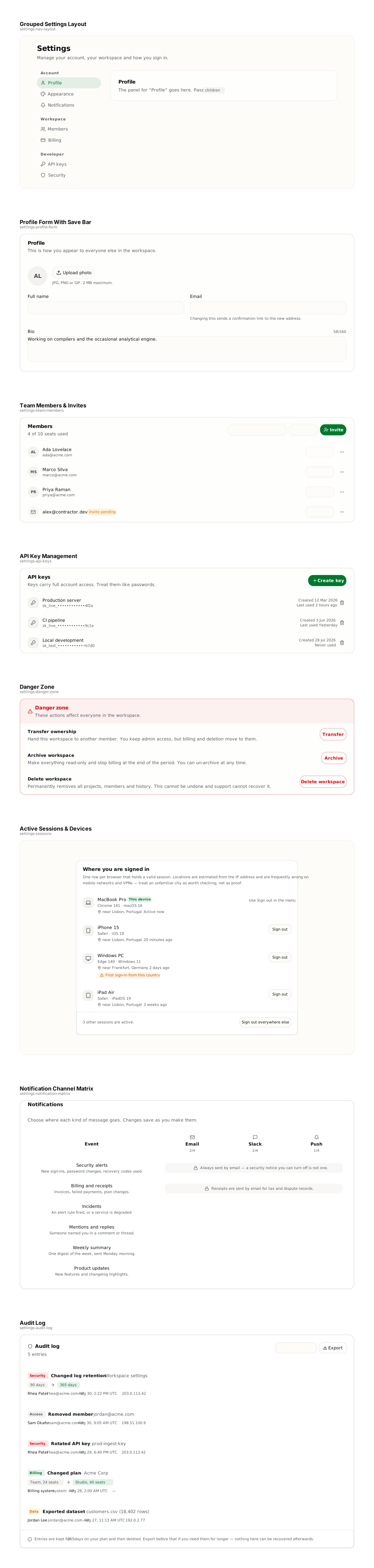

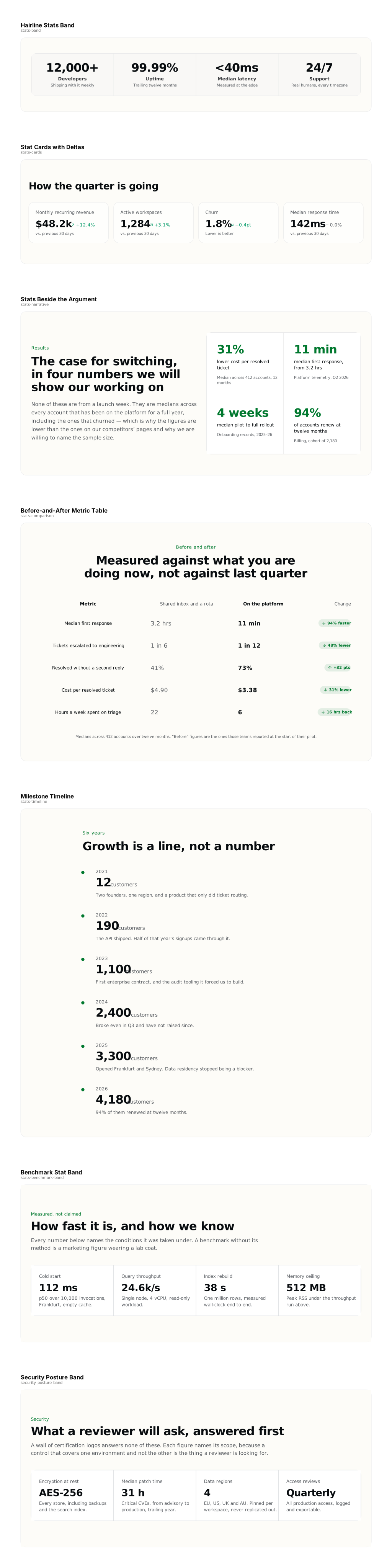
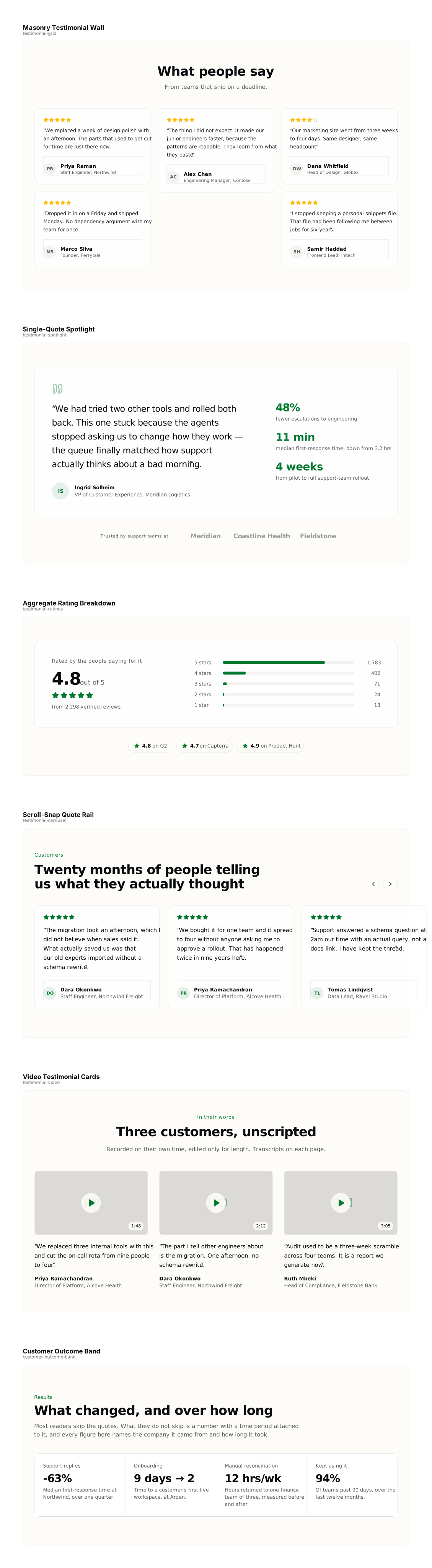
Traced 2026-09-22 from the live catalog. Rebuilt whenever the sections change — the build fails if these files fall behind what is in the catalog.
Controls for Figma: tabs, menus, dialogs and the rest
The small pieces every screen is assembled from — 54 controls in 12 files, traced from what renders, the same way as the sections above. Drag one onto a canvas and each control arrives as a named, editable frame.
A frame shows one state. A menu is drawn open, so you can see it; a dialog is drawn as the buttons that open it, and a tooltip as the buttons it labels, because a modal covering the page or a tip that only exists on hover cannot be a static layer. Still frames, not components: no variants, no auto-layout, no interaction.
- Actions3 controls · 11 KB
- AI & Chat7 controls · 21 KB
- Date & Time5 controls · 15 KB
- Form Controls7 controls · 14 KB
- Frames & Mocks4 controls · 13 KB
- Identity2 controls · 6 KB
- Navigation & Steps6 controls · 16 KB
- Overlays & Feedback4 controls · 11 KB
- Pickers & Media6 controls · 20 KB
- Selection5 controls · 18 KB
- Status & Labels4 controls · 9 KB
- Structure1 control · 2 KB
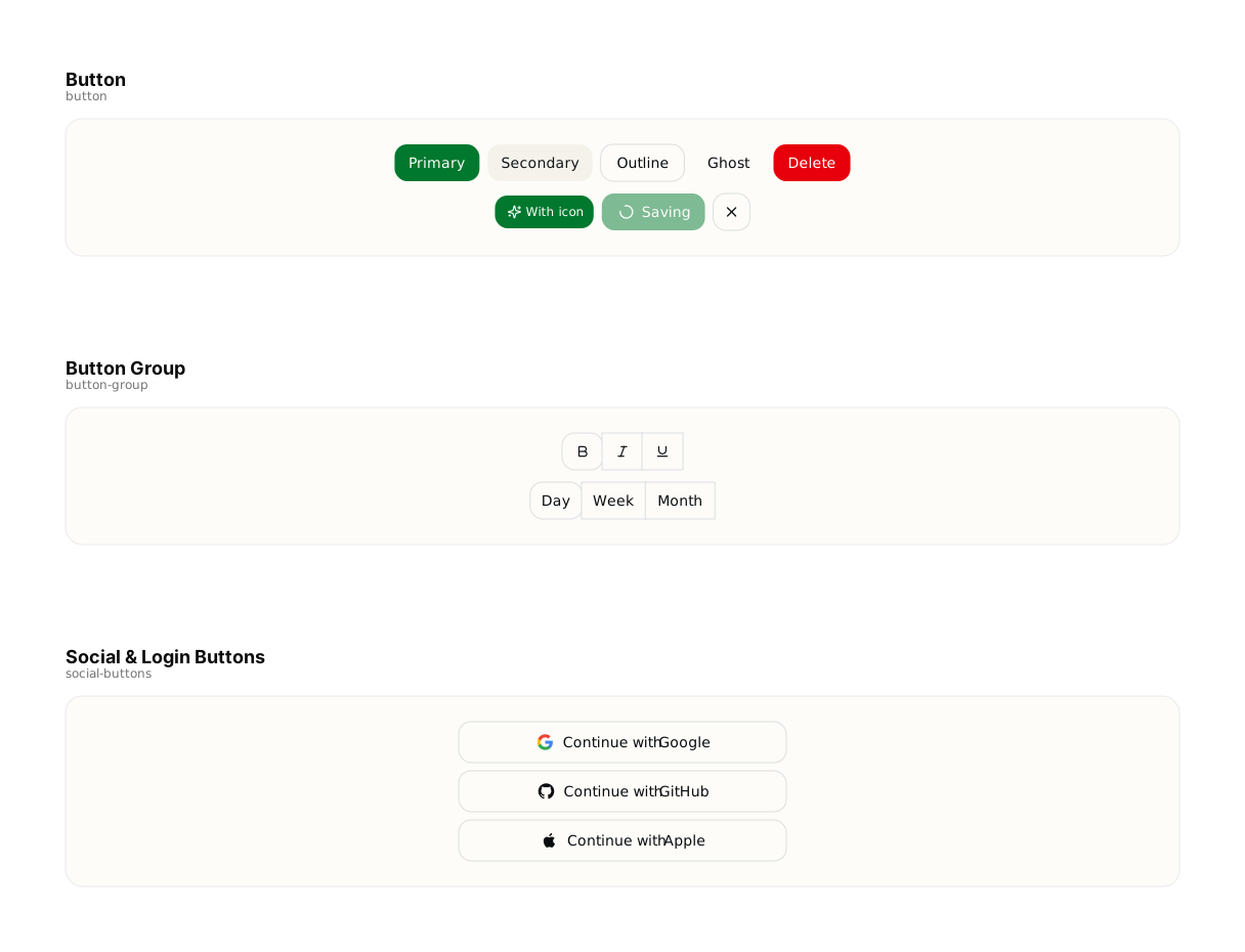
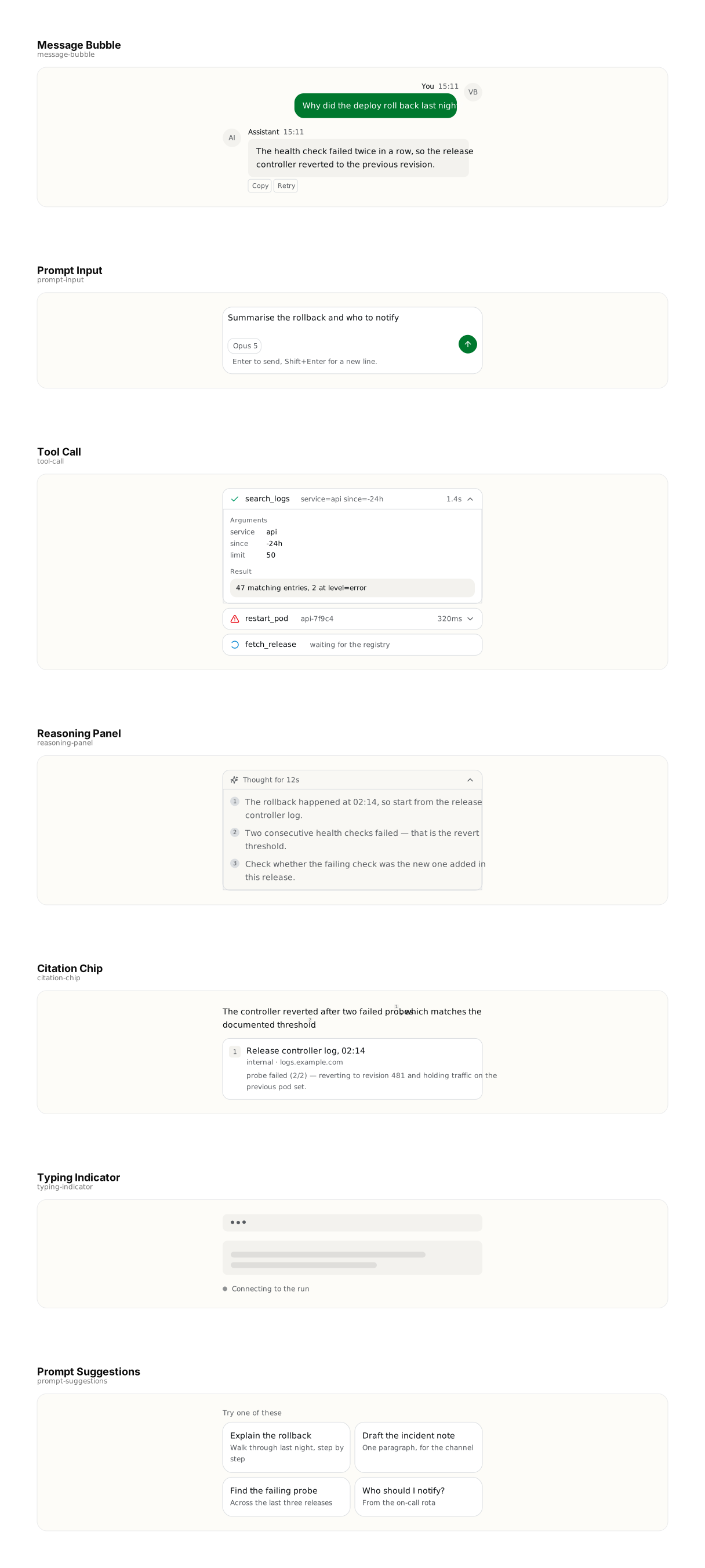
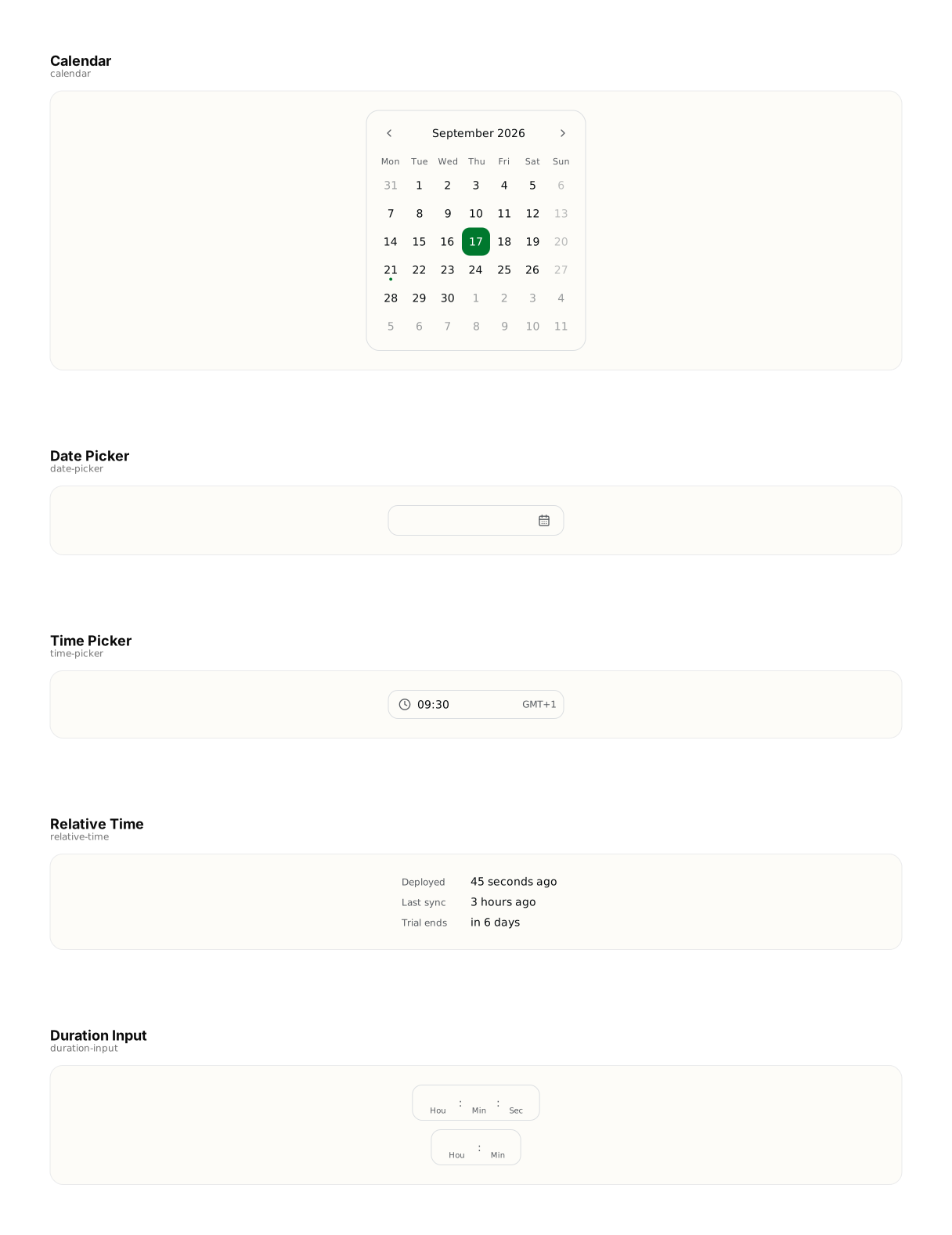

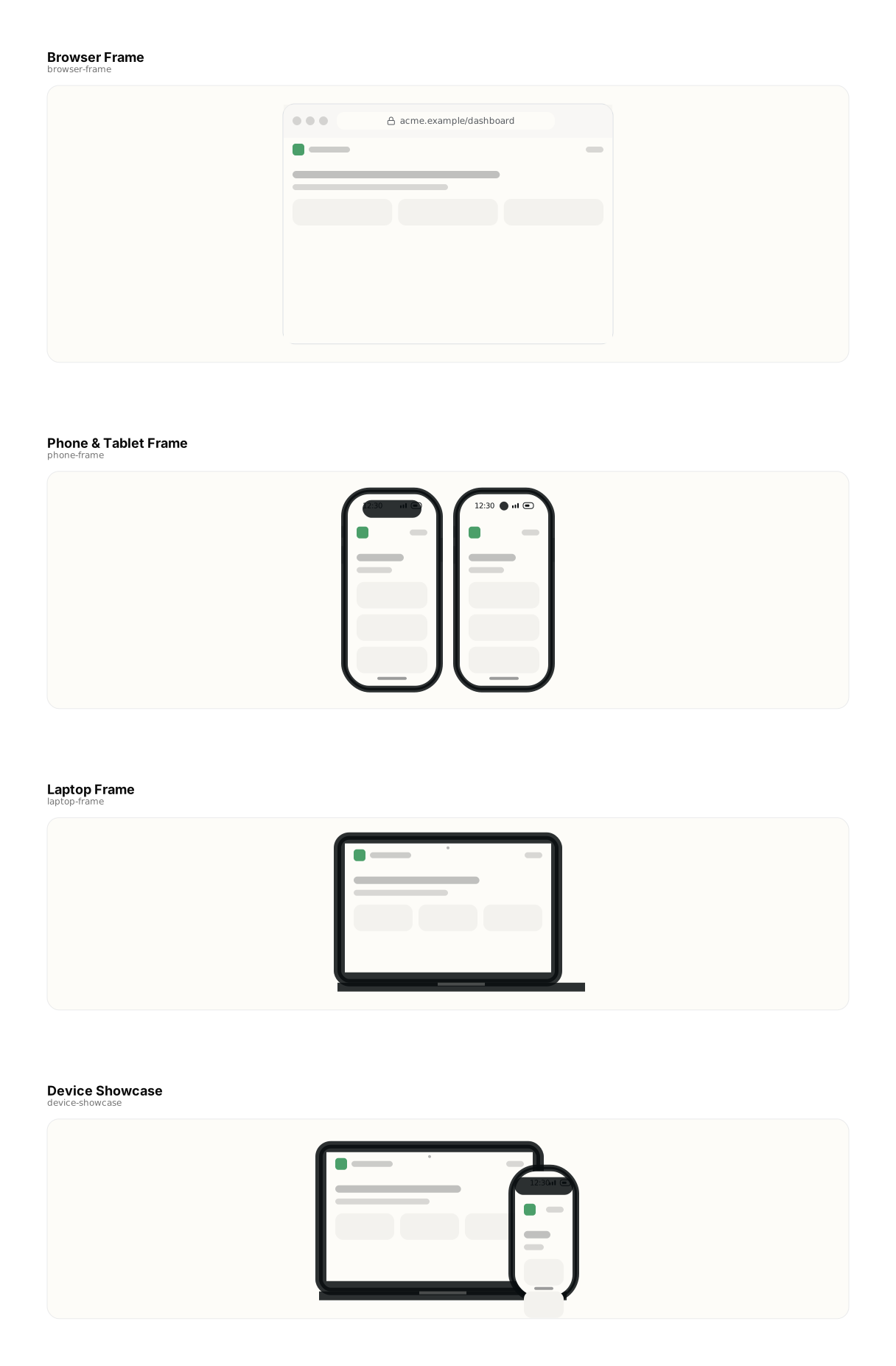


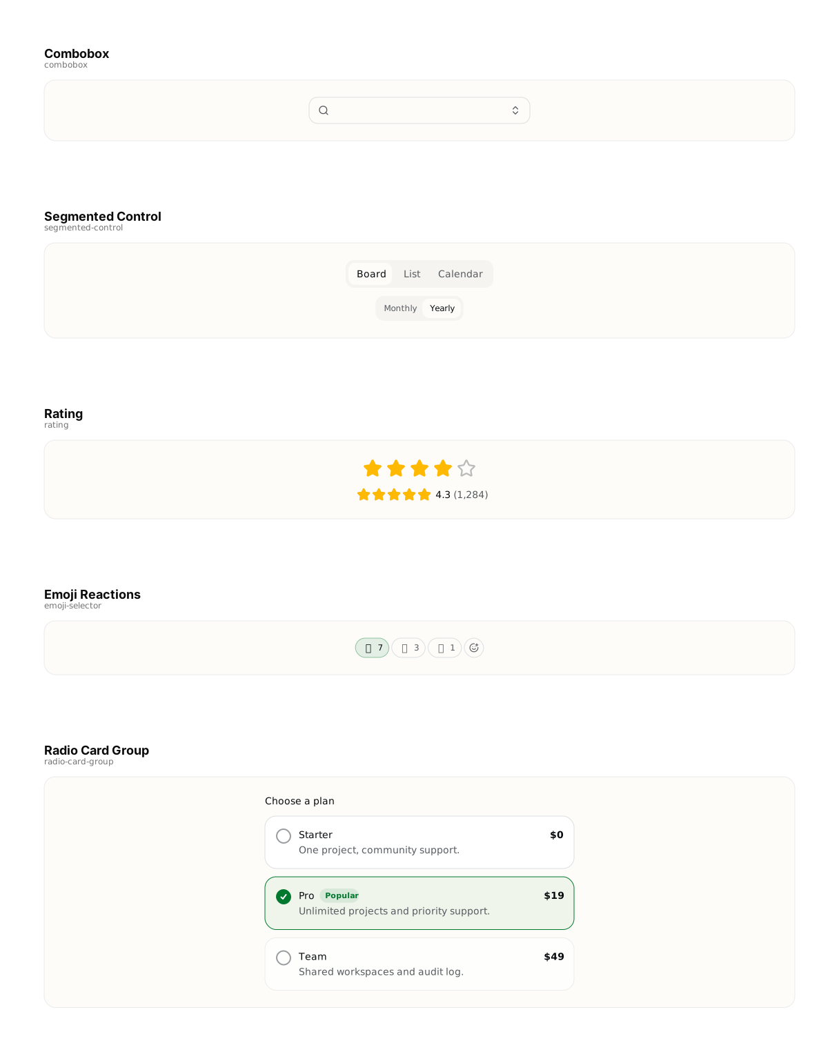

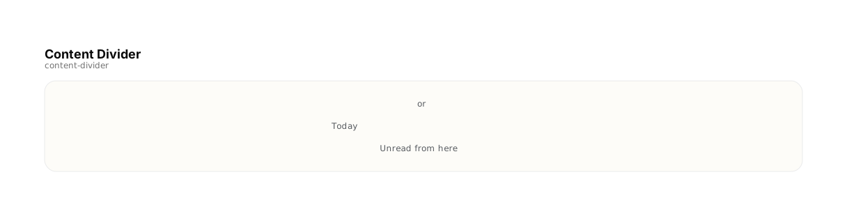
Traced 2026-09-21 from the live catalog. The build fails if these files fall behind what is in it.
Icons for Figma, by category
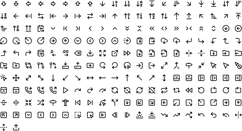
1,544 icons in 42 categories, one file each, grouped the way Lucide groups them and listed with the ones a product needs first. Drag a file onto a canvas and every icon arrives as a named layer on a 24px grid.
They stay strokes, not outlined shapes — select a few and change the stroke colour or weight once. These are layers, not components, and there are no size or weight variants: Figma already scales and re-strokes a selection, and a fake matrix of variants would be bulk, not function. An icon that sits in two categories, as many do, is in both files.
- Arrows202 icons · 56 KB
- Account122 icons · 43 KB
- Files145 icons · 50 KB
- Communication51 icons · 19 KB
- Layout135 icons · 42 KB
- Design137 icons · 46 KB
- Development228 icons · 77 KB
- Charts31 icons · 11 KB
- Finance53 icons · 19 KB
- Security52 icons · 20 KB
- Devices157 icons · 55 KB
- Notifications37 icons · 12 KB








Show the other 30 categoriesShow fewer
- Time54 icons · 18 KB
- Navigation78 icons · 29 KB
- Shopping25 icons · 10 KB
- Text231 icons · 72 KB
- Multimedia128 icons · 41 KB
- Social105 icons · 36 KB
- Connectivity87 icons · 30 KB
- Tools65 icons · 24 KB
- Accessibility29 icons · 11 KB
- Animals23 icons · 11 KB
- Buildings22 icons · 10 KB
- Cursors30 icons · 12 KB
- Emoji13 icons · 7 KB
- Food & beverage71 icons · 31 KB
- Gaming136 icons · 45 KB
- Home50 icons · 20 KB
- Mail25 icons · 9 KB
- Math73 icons · 21 KB
- Medical40 icons · 15 KB
- Nature20 icons · 8 KB
- People3 icons · 2 KB
- Photography68 icons · 24 KB
- Science31 icons · 13 KB
- Seasons4 icons · 3 KB
- Shapes47 icons · 16 KB
- Sports9 icons · 4 KB
- Sustainability19 icons · 8 KB
- Transportation56 icons · 21 KB
- Travel62 icons · 24 KB
- Weather41 icons · 15 KB



























Lucide 0.525.0, ISC licence — the notice is inside every file, and the full text is in LICENSE.txt. 67 icons Lucide has since deprecated, including the brand marks such as GitHub and Twitter, are left out on purpose. Rebuilt on every build.
Or start from a whole project
If the design is a full product rather than a screen, 32 deployable templates sit above the blocks — the agent can scaffold one and then bend it towards your design.